The Frustrating Reality of Empty Living Room Walls
Imagine this scenario. You spend weeks looking for the perfect piece of art. You find a painting that you absolutely love. You bring it home, hang it up, and step back to look.
Suddenly, your heart sinks. The painting looks tiny on your big wall. It looks like a small postage stamp on a giant envelope. Or maybe it is so big that it makes your sofa look like dollhouse furniture.
This is a problem many people face every day. It is not just about the art itself. It is about the scale and the feeling of the room. When the size is wrong, the whole room feels “off.”
You want your home to feel cozy and professional. But instead, it feels messy or unfinished. This constant feeling of “something is missing” can be very annoying when you are trying to relax.
Why Finding the Right Size Feels Impossible
Many people try to fix their walls but fail. They often follow bad advice or just guess the measurements. Here is why the struggle continues for so many homeowners:
-
Buying on impulse: We see something pretty in a store and buy it without thinking about our wall space.
-
Ignoring the furniture: People look at the wall as a blank box. They forget that the sofa or table below the art changes everything.
-
Small shop syndrome: Art often looks much bigger in a small boutique than it does in your open-plan living room.
-
The fear of math: Many of us hate measuring. We try to “eye it,” which almost always leads to a mistake.
-
Too many options: With thousands of sizes online, it is easy to feel overwhelmed and just pick a random one.
When you keep getting it wrong, you end up wasting money. You might have a closet full of frames that don’t fit. This makes you lose trust in your own decorating skills.
How Poor Decorating Affects Your Daily Life
Your living room is where you host guests and spend time with family. If the wall art is the wrong size, it creates a strange energy in the room. You might not notice it consciously, but your brain does.
-
It creates visual stress. A wall that is out of balance makes the room feel cluttered. This can make it harder for you to relax after a long day.
-
It lowers your home pride. You might feel shy about inviting friends over because the room doesn’t look “put together.”
-
It ruins your investment. You spent a lot of money on your sofa and rug. If the art is wrong, it makes those expensive items look cheap too.
-
It stops your creativity. When you fail once, you might be afraid to try again. This leaves your home feeling cold and empty for years.
You deserve a home that reflects your personality. You want a space that feels balanced and warm. Understanding the simple rules of sizing is the key to fixing this forever.
Let’s look at how we can solve this problem using easy, step-by-step methods. You don’t need to be an expert to get this right. You just need a plan.
Start by Measuring Your Anchor Points
Before you even look at art, you must look at your furniture. In most living rooms, the “anchor” is the sofa. This is the piece of furniture that the art will live above.
The art should always relate to the furniture below it. If you have a long sofa and a tiny picture, the picture will look lost. If the art is wider than the sofa, it will look like it is crashing down on you.
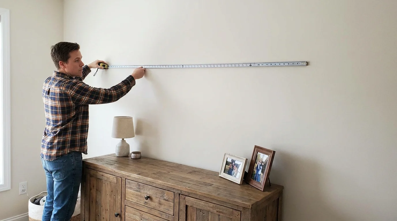
Grab a measuring tape. Measure the total width of your sofa from arm to arm. Write this number down. This is your most important piece of data.
If you are hanging art above a console table or a fireplace, measure that width instead. The furniture acts as a frame for the art. This is a secret that professional decorators use to create balance.
Think of your wall like a puzzle. The furniture is the first piece. The art must fit into the space left behind in a way that feels natural and easy on the eyes.
Use the 60 to 75 Percent Rule for Perfect Balance
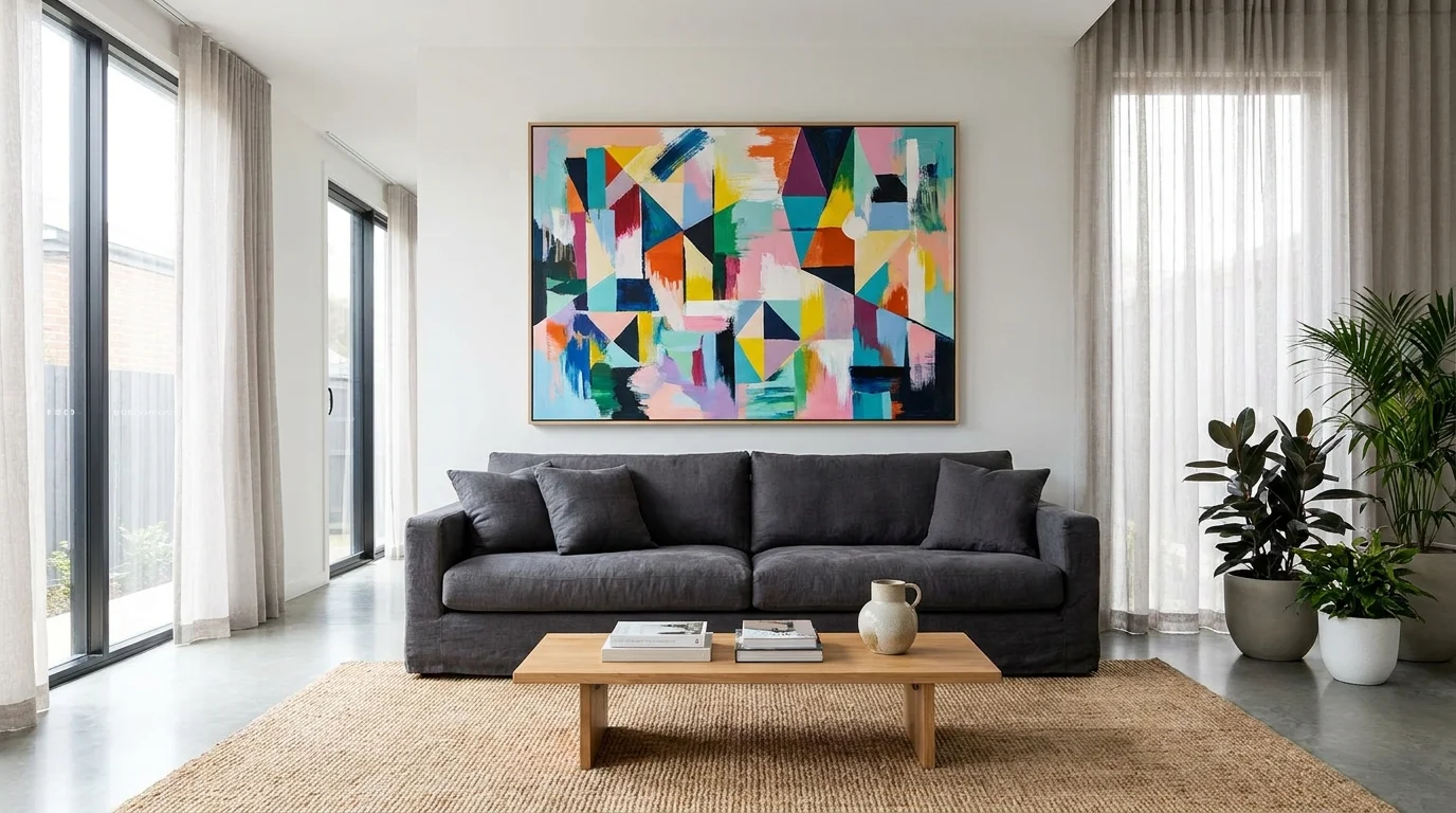
This is the golden rule of interior design. It is a simple way to make sure your art is never too small or too large. Your wall art should take up about 60% to 75% of the width of the furniture below it.
Let’s do some very simple math. If your sofa is 80 inches wide, you want your art to be around 48 to 60 inches wide. This creates a beautiful “focal point” that fills the space correctly.
Why does this work? It leaves just enough empty space on the sides. This space allows the wall to “breathe.” It makes the art look like it was custom-made for that exact spot.
If you are using a single large painting, look for one in that size range. If you are using a group of two or three pictures, the total width of the whole group should follow this rule.
Don’t forget to include the gaps between the frames. If you have two 20-inch frames with a 5-inch gap, your total width is 45 inches. Keep that total number within the 60% to 75% range.
This rule is a safety net. It stops you from buying things that are too small. Most people naturally pick things that are too tiny. This rule pushes you to go bigger, which usually looks much more expensive and professional.
The Secret of Gallery Height and Vertical Space
Size is not just about how wide the art is. It is also about where it sits on the wall. If you hang a perfectly sized painting too high, it will still look wrong.
A common mistake is hanging art too close to the ceiling. This makes the room feel short and awkward. Instead, you should follow the “eye-level” rule used in art museums.
The center of your art should be about 57 to 60 inches from the floor. This is the average human eye level. When art is at this height, it feels connected to the rest of the room.
If you are hanging it above a sofa, there is another rule to follow. Leave about 6 to 10 inches of space between the top of the sofa and the bottom of the frame.
This small gap is very important. It keeps the art and the furniture “talking” to each other. If the gap is too big, the art looks like it is floating away into space.
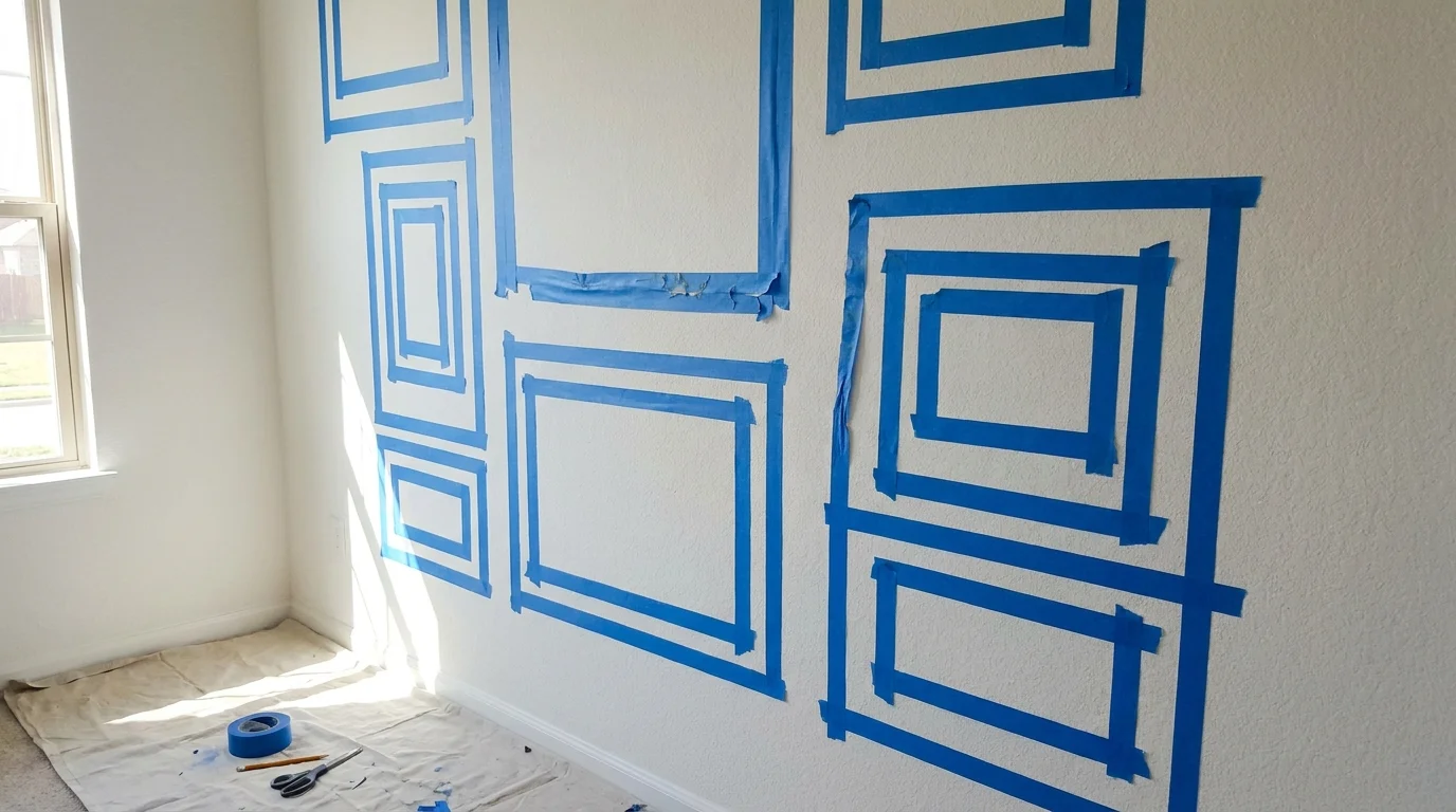
Use blue painter’s tape to test your size. Before you buy any art, cut out a piece of paper or use tape to mark the size on your wall. Leave it there for a day.
Walk into the room at different times. Does the size feel good? Does it look right from the kitchen? This simple test can save you from making a very expensive mistake.
Matching Art Shapes to Your Wall Shape
Not all walls are the same. Some are tall and narrow. Others are short and long. You must match the shape of your art to the shape of your wall space.
If you have a tall wall with high ceilings, look for “portrait” style art. This means the art is taller than it is wide. This draws the eye upward and makes use of that vertical space.
If you have a long wall behind a dining table, look for “landscape” style art. This means it is wider than it is tall. This follows the horizontal line of the furniture and feels very stable.
Think about the “white space” around the art. You don’t want the art to touch the corners of the wall. Always leave at least 12 inches of empty wall space on all sides.
This creates a “border” effect. It makes your art look like a precious object. If you crowd the art into a corner, it loses its power and looks like an afterthought.
If you have a very large wall and cannot find a huge painting, don’t worry. You can use multiple smaller pieces to create a large “shape.”
Three vertical paintings hung side-by-side can act as one large horizontal piece. This is a great way to save money while still filling the space correctly. It gives you the look of a large custom piece without the high price tag.
By following these steps, you are building a foundation for a beautiful home. You are moving from guessing to knowing. In the next part, we will explore even more advanced tips to help you master your living room walls.
Mastering the Art of the Gallery Wall Layout
Now that we have covered the basic rules for single pieces, let’s talk about gallery walls. A gallery wall is a group of smaller items that work together as one large unit. This is a great way to fill a big space without spending thousands on one giant canvas.
When you create a gallery wall, you must treat the entire collection as one single shape. If you have ten small frames, do not spread them out across the whole wall. This makes the room look messy and disorganized. Instead, keep them close together.
A good rule of thumb is to keep two to three inches of space between each frame. If the frames are very small, stay closer to two inches. If the frames are thick and heavy, three inches works better. This small gap allows each piece to shine while still feeling connected.
The total width of your gallery wall should still follow the 75% rule. If your sofa is 80 inches wide, your whole group of pictures should be about 60 inches wide. Balance is everything when you are working with multiple items.
You can mix different types of art, like photos, sketches, and even mirrors. This adds a layer of personality to your living room. Just make sure the overall weight of the arrangement feels even on both sides.
Protecting Your Investment for the Long Term
Choosing the right size is just the beginning. You also want your living room to look great for years to come. Many people forget that environmental factors can change how art looks in a space.
For example, direct sunlight can fade your art over time. If a painting loses its color, it will stop being a strong focal point. It will look weak and “thin” on the wall, even if the size is perfect. Always check where the sun hits during the afternoon.
Another expert secret is to rotate your art occasionally. You don’t need to buy new things every month. Simply moving a piece from the bedroom to the living room can refresh the entire vibe. It keeps your home feeling alive and interesting.
If you have a very large piece, make sure your wall anchors are strong enough. A heavy frame that leans forward or hangs crookedly ruins the visual lines. Straight lines create a sense of calm and professional design.
Lastly, keep your frames clean. Dust and smudges on the glass make the art look smaller because they block the light. Bright, clean surfaces reflect more light and help the art stand out as a bold statement in your living room.
Designing Around High Ceilings and Open Spaces
If you live in a modern home with very high ceilings, the standard rules might feel a bit different. A tall wall can make even a medium-sized painting look like a toy. In this case, you need to think vertically.
Instead of one wide piece, try hanging two large pieces, one above the other. This creates a “vertical pillar” of art that draws the eye upward. It fills the empty height of the room and makes the space feel more expensive.
In an open-concept living room, your art helps define different zones. You can use a large piece of art to show where the “living area” ends and the “dining area” begins. This acts like an invisible wall that organizes your home.
Scale is your best friend in large spaces. If your room is huge, do not be afraid to go big. A giant piece of art can actually make a large room feel cozier by filling the void. It gives your eyes a place to rest.
If you are worried about the cost of giant art, consider a large tapestry or fabric wall hanging. These are often lighter and more affordable than framed canvases. They add texture and warmth while covering a lot of square footage.
Common Pitfalls That Ruin Your Wall Decor
Even with the best intentions, it is easy to make mistakes that distract from your beautiful home. Knowing what to avoid is just as important as knowing what to do. Here are the most common errors people make when sizing their art:
-
The “Postage Stamp” Mistake: This happens when a tiny frame is placed on a massive wall. It looks lonely and out of place. If you love a small piece, put it in a larger frame with a wide mat to give it more size.
-
Hanging Art Too High: This is the number one mistake in home decor. People often hang art near the ceiling. Art should be at eye level. If you have to look up to see it, it is too high.
-
Ignoring the Color Story: If your art is the right size but the wrong color, it will clash. The colors in the art should complement the colors in your rug and pillows.
-
Forgetting about Lighting: Dark corners make art disappear. Even a perfectly sized piece will look bad if it is in the dark. Use a picture light or a nearby lamp to highlight your favorite pieces.
-
Using the Wrong Frame Style: A very thin frame can make a piece look flimsy. A very thick frame can make a small piece look crowded. Match the frame weight to the size of the art.
These mistakes can make your living room feel unbalanced. They can make your furniture look cheap and your space feel uninviting. By avoiding these traps, you ensure that your home feels harmonious and professional.
If you have already made some of these mistakes, don’t worry. Most of them are easy to fix. Lowering a painting or adding a second piece next to it can change the whole look in minutes.
Creating a Home You Truly Love
Taking the time to measure and plan your wall art shows that you care about your space. Your living room is the heart of your home. When it looks balanced and beautiful, you will feel more relaxed and happy every time you sit on your sofa.
Don’t feel pressured to finish everything in one day. Great decor takes time. Start with your main wall and follow the 60% to 75% rule. Use your painter’s tape to visualize the space before you spend any money.
Trust your instincts. While the rules are there to help you, your home should ultimately reflect who you are. If a piece makes you smile every time you see it, you have found the right one.
Use these tips as a guide to build your confidence. You have the tools now to stop guessing and start creating. Your dream living room is within reach, and it all starts with a single measurement.
Go grab your measuring tape and look at that empty wall again. What do you see now? You see potential. You see a chance to make your home a masterpiece. Happy decorating!